A tactile love letter to the art of papermaking
Light streams through tall windows into a Manchester studio, where designer Laura Jane Boast runs her fingertips across a collection of uncoated fine papers. The sheets – natural and velvety, each possessing its own subtle personality in shade, texture and light absorption – respond to her touch.
“Print,” Boast says, “should be felt, not just seen.”
There’s nothing metaphorical in her statement. Laura Jane Boast’s latest collaboration with European paper manufacturer Mondi represents a deliberate stand – a pushback against digital exhaustion, ephemerality and the growing disconnection between ourselves and the physical world.
This rebellion takes shape as Full Spectrum Feels, a project born not from marketing directives, but a provocative query: how can paper still stir emotion?
The question is not merely rhetorical. It echoes what futurologist John Naisbitt identified in the 1980s as the ‘high-tech / high-touch’ principle. In his seminal work Megatrends, Naisbitt argued that the faster technology advances, the more we crave sensory experience. The more time we spend navigating virtual environments, the deeper our yearning for something authentic, tactile – something real.
Crafting emotion: The making of ‘Spectrum of Impressions’
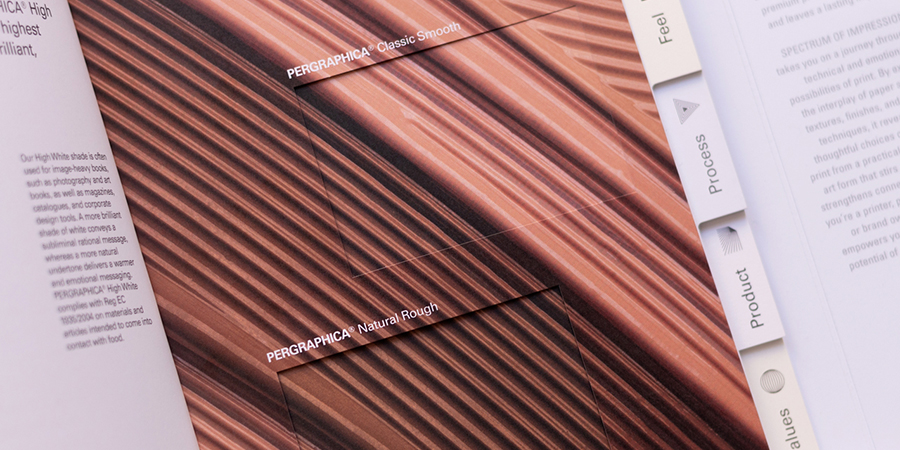
At the heart of the project lies a meticulously crafted volume – Spectrum of Impressions: The Print Book. Neither a conventional catalogue nor a sample collection, it exists as both object and invitation – a sensory atlas made to be touched, caressed, turned and explored without haste. Created exclusively with PERGRAPHICA® papers, the book presents a wide range of shades, surfaces, special finishes and print, but with a purpose that goes beyond commercial display – to spark wonder.
From the opulent shimmer of hot foiling and the subtle tactility of microembossing, to intricate laser engravings and layered die cuts, every detail is designed to slow the reader down. One spread contrasts raised and gloss varnishes. Another features three identical images printed on different white shades – Classic, High White and Natural. The aim is not to dazzle, but to shift perspective.
“Every decision was about igniting curiosity,” Boast explains. “Touch is our primal language. In design, we’ve rather lost sight of that, haven’t we?”
This thinking speaks to something deeper than aesthetics. Touch helps people find orientation in a complex world – grounding us in the here and now. In a time of constant screen exposure, the simple act of leafing through a book or opening a beautifully crafted package has become a rare luxury – a moment to slow down and be present.
Sustainability, legacy and the value of presence
Behind its sensory richness, the book embodies design intentionality. Across five chapters representing the key decisions on the print buying journey – Look, Feel, Process, Product and Values – it unpacks the physical language of premium print. Showcasing curated shades from the PERGRAPHICA® Colours range, four white hues with smooth and rough textures, and perfectly executed prints and finishes, it reveals the precision available to those who design with purpose – and with the right materials.
Rather than listing technical details, Spectrum of Impressions lets readers discover them on a carefully mapped journey. Pantone inks. Layered foils and embossing. Carefully selected shades and surfaces, height and depth, die and laser cuts are placed side by side for tactile comparison – so differences can be felt, not just seen. It is, in essence, a manual without instructions – a guide not only for printers and converters, but for anyone seeking to turn ideas into tangible impact on paper.
In a world of swipeable screens and slick displays, the campaign’s tactility feels striking. Yet Spectrum of Impressions: The Print Book is not nostalgic. It offers what digital experiences cannot: a sense of presence, of care, of permanence. A print piece that doesn’t fade—it stays with you. A physical object that doesn’t whisper—it resonates.
This experience is grounded in PERGRAPHICA®, Mondi’s premium uncoated paper range, produced at the Neusiedler mill in Austria using 100 percent renewable electricity. The paper holds Cradle-to-Cradle, FSC® and EU Ecolabel certifications – a rare combination even among luxury materials. While these qualities cannot be physically sensed, the Values chapter makes one thing clear: “PERGRAPHICA® isn’t just premium—it’s principled.”
From ‘Catching Feels’ to ‘Full Spectrum Feels’: Emotional print is blooming
For Mondi Uncoated Fine Paper, Full Spectrum Feels builds on the success of the earlier Catching Feels campaign, winner of over 20 international B2B marketing awards, launched in September 2020. In partnership with international Adobe Stock photographers and illustrators, PERGRAPHICA® created a luxurious lookbook that doesn’t just showcase art—it channels emotion. Six powerful themes, from Serenity to Individuality, capture the pulse of a changing world, printed with purpose on paper that amplifies every feeling.
While Catching Feels highlighted how PERGRAPHICA® can transpose digital creativity from the screen to the page to perfection, Full Spectrum Feels takes it further. This campaign doesn’t just capture the intersection of premium paper and creativity – it invites people to experience it deeply with their fingertips. Each combination of paper, colour and finish is there to be judged not with eyes alone, but with hands.
In addition to The Print Book, the campaign includes a limited edition of six thread-stitched notebooks, each featuring a core of three different white shades, in rough and smooth surfaces, open-bound inside a three-layer cover combining contrasting warm and cool, deep and pale shades from the PERGRAPHICA® Colours spectrum – Noble Red, Mysterious Blue, Smiling Yellow and more. Each is hand-finished with matching thread – a quiet reminder that craftsmanship and perfection are in the details.
“Design has become dreadfully screen-bound,” Boast reflects. “But paper surprises you. It invites you to linger. It holds you in the moment.”
Her words reflect a wider shift in how we value media. As work and life become increasingly digital, physical experiences grow more meaningful. Naisbitt’s ‘high-tech / high-touch’ principle feels more relevant than ever: the more efficient we become, the more we seek connection – something to hold, something that holds us.
Emotion as invitation: A different kind of campaign
There’s always a risk in building a campaign around feeling. Emotion doesn’t scale easily. But that is precisely the point. Full Spectrum Feels is not about selling paper. It’s about reminding us why we fell in love with print in the first place – the sensation of paper under fingertips, and the care that goes into every detail.
For Mondi, whose PERGRAPHICA® Colours range expanded in 2020 to include 31 shades – 10 Dark and Deep exuding luxury, 10 popping Rich tones and 10 dreamy Pale shades – this connection is not incidental, it is essential. The range was inspired by creatives for creatives, premium brand owners and packaging producers who understand that in a digital world, paper has become a canvas for an experience.
High-quality print – its scent, it sound, its texture, its depth – offers a moment of calm in a high-tech world. A well-designed book or box becomes an oasis, a deliberate break from the noise.
Because paper is more than just a surface. It is presence. It is permanence. It gives physical weight to our ideas. And in doing so, this multisensorial campaign from a European paper company has a lasting and distinctly emotional resonance.
It reminds us that even in a world of pixels and programming, we are still physical beings. We crave texture. We hunger to feel.
Sometimes, all it takes is the perfect sheet of paper.
.jpg)