Julia’s Print Clinic –
Why Don’t My Printed Colours Match my Monitor?
Julia Artwork Advice Expert – Graphic Warehouse Customer Service Team
RGB, CMYK and Better Colour in Print
I check and correct thousands of artwork files every year before they reach the Graphic Warehouse production team. One of the most common questions I hear is: “Why does the colour on my printed job look different from the colour on my screen?”
It can feel frustrating, especially when the artwork looked bright, punchy and exactly right on your monitor.
The reassuring answer is that a colour difference does not automatically mean anything has gone wrong. Screens and printers create colour in completely different ways, and the material, ink, colour profile, lighting and screen settings can all influence the result.
The aim is not to make colour complicated. It is to help you understand what to expect and know when to ask us for advice.
I am part of the Graphic Warehouse Customer Service team, and a big part of my role is checking artwork before it moves into production.
Across a year, that means looking at thousands of files containing photographs, brand colours, logos, gradients, spot colours, black backgrounds and everything in between.
“Colour issues are some of the most common questions I see. A few simple checks can make the result far more predictable.”
Julia’s Print Clinic turns the questions we answer every day into practical guides for trade printers, sign makers, commercial printers, copy shops, designers and print resellers.
Print Clinic - Screen Colour vs Printed Colour
A screen produces colour with light. A printer produces colour with ink.
Your monitor shines light directly towards your eyes. Printed material reflects the light around it. That difference means the same colour values cannot always create the same visual result.
A bright blue on a backlit screen may look less luminous when printed. A neon green may have to be mapped to a more printable green. A deep black may need a different setup depending on whether it is small text or a large background.
RGB vs CMYK
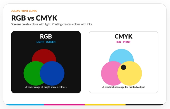
Screens create colour with red, green and blue light. Printing uses process inks.
What Is RGB?
RGB stands for Red, Green and Blue. It is an additive colour model that creates colour by combining different amounts of coloured light.
RGB is used by monitors, phones, tablets, televisions, cameras and digital signage.
Because light is being emitted directly from the screen, RGB can display some very bright and luminous blues, greens, oranges and pinks.
What Is CMYK?
CMYK stands for Cyan, Magenta, Yellow and Key, meaning black. It is a subtractive colour model used for process printing.
The printed result is affected by the printer, inks, profile, material, surface finish and surrounding light. This is why identical CMYK values may not look identical on every material or output system.
Why Bright Colours Can Change
Many RGB colour spaces contain colours that fall outside the reproducible range of a specific CMYK print condition. These colours are often described as out of gamut.
During a managed conversion, an out-of-gamut colour is mapped to a colour that the output system can reproduce.
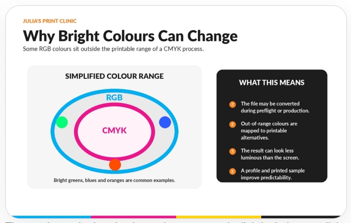
The result may be less luminous, less saturated, slightly darker or a little warmer or cooler.
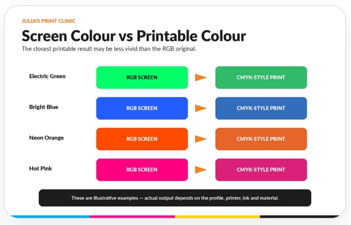
Illustrative examples only: the actual result depends on the output profile, printer, inks and material.
Think of colour conversion as translation. The aim is to find the closest useful printable interpretation, but not every screen colour has an exact ink-based equivalent.
What Happens When an RGB File Is Uploaded?
Graphic Warehouse’s online preflight system checks whether your artwork contains RGB, CMYK or spot colours.
That warning is useful because it lets you know what colour information is present before the job moves into production.
Understand which colour spaces are present.
Keep the original editable artwork.
Avoid repeatedly converting backwards and forwards.
Use the agreed output workflow.
Speak to the team when a particular brand colour is critical.
Learn more about Graphic Warehouse’s online preflight and artwork workflow .
What Is a Colour Profile?
A colour value on its own is only a set of numbers. A colour profile gives those numbers context and describes how a device or colour space represents colour.
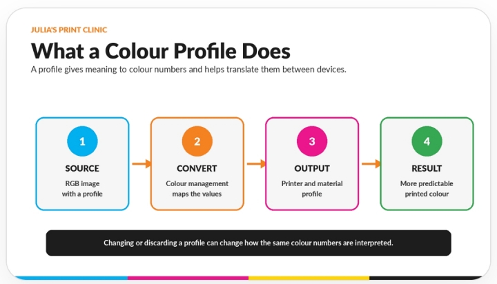
Profiles help colour-management software translate between a camera, RGB working space, design application, proofing display and printer-and-material combination.
Avoid randomly assigning, deleting or changing profiles. If you are unsure which profile or conversion route to use, ask the production team rather than guessing.
Can I Trust What I See on My Monitor?
Your monitor is useful, but it is not automatically an accurate physical proof.
Two people can open the same file and see noticeably different colour because their screens have different brightness, contrast, white point, colour settings, calibration and viewing conditions.
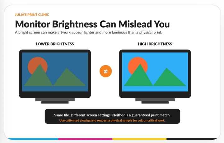
Avoid setting the display excessively bright.
Use a calibrated monitor where possible.
Work in consistent lighting.
Use colour-managed applications.
Remember that a screen emits light while a print reflects it.
The Material Changes the Result
The same artwork can look different on different materials because the colour you see is affected by the surface underneath the ink.
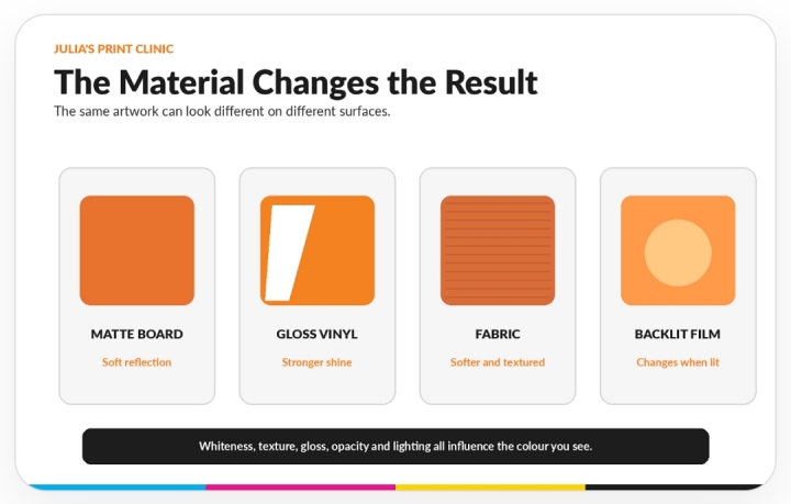
Whiteness can make colour appear warmer or cooler.
Gloss changes reflection and apparent depth.
Fabric and textured surfaces scatter light.
Transparent materials interact with the background.
Backlit graphics change when illuminated.
When colour consistency across several materials is important, tell us before production so the job can be assessed as a coordinated project.
Black Is Not Always Just Black
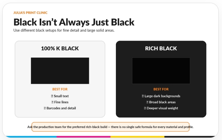
Comparison of 100% K black for small text and rich black for large solid areas.
100% K Black
A black using only the black channel is commonly written as C0 M0 Y0 K100. It is usually the safer approach for small black text, fine lines, barcodes and detailed black artwork.
Rich Black
A rich black combines black with percentages of other process colours and can create a visually deeper result for large backgrounds and broad solid areas.
There is no single universal rich-black recipe. The best build depends on the printer, ink set, material, profile and total ink limit. Ask the Graphic Warehouse team for the preferred values for your selected product.
Keep Your Blacks Consistent
Avoid mixing several black builds in the same design unless the difference is intentional. Check photographs, logos, vector shapes and backgrounds before exporting the PDF.
Pantone and Spot Colours
A spot colour is traditionally produced using a premixed ink. Pantone references are commonly used to communicate a target colour.
In digital large-format printing, a spot-colour reference may be reproduced using process inks and the printer’s colour profile rather than a separate premixed ink.
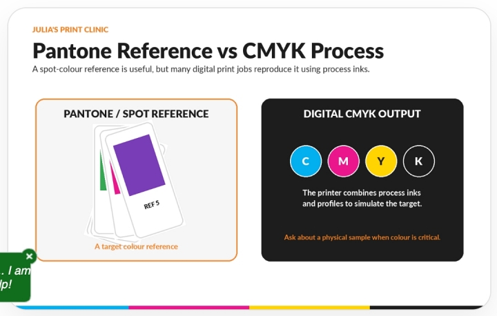
Provide the correct Pantone reference.
Explain where the colour appears and why it matters.
Do not choose the reference using only an uncalibrated screen.
Ask whether a printed sample is appropriate.
Approve the expected result before the full production run.
Proofs and Samples
Why an Office Printer Is Not a Reliable Colour Proof
A desktop print is useful for checking spelling, page order, rough layout and whether elements are missing. It is not a reliable proof of a large-format colour result.
Office printers use different inks, profiles, papers and automatic adjustments from the final production process.
What an Online Proof Can Tell You
An online proof is excellent for checking artwork, size, orientation, bleed, cutlines, drill holes, positioning and preflight warnings.
A PDF viewed on a screen cannot guarantee the exact physical appearance of printed colour.
When to Consider a Printed Sample
The colour is part of a strict brand identity.
Several materials must coordinate.
A large quantity is being produced.
The design contains difficult bright colours.
A previous job must be matched.
The client will reject noticeable variation.
A sample takes additional time, but it can prevent a much more expensive disagreement later.
A More Predictable Colour Workflow
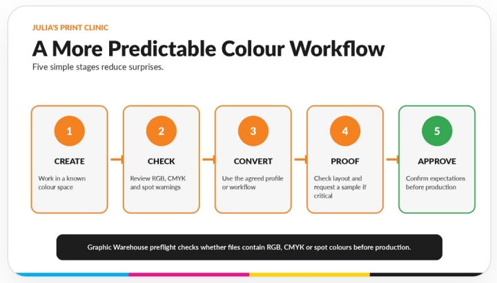
Five-step colour workflow from creating and checking artwork to proofing and approval.
Common Colour Mistakes
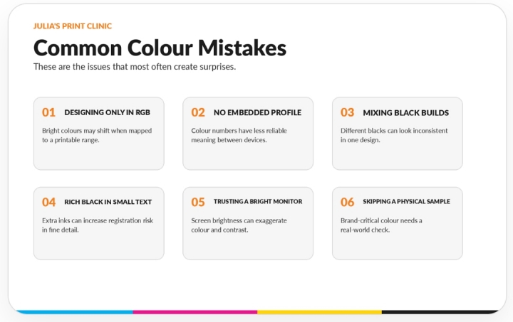
Designing Only for the Screen
Artwork uses very bright RGB colours without checking how they will translate to print.
Removing or Ignoring Profiles
Colour values are left without useful context, or a profile is changed without understanding the effect.
Mixing Several Black Builds
Different elements that should match use different combinations of CMYK.
Using Rich Black for Small Text
Fine detail uses several inks when a simpler black build would be safer.
Trusting a Very Bright Monitor
The display makes the artwork appear more luminous than the physical print.
Skipping a Sample for Brand-Critical Work
A large run is approved without physically checking a colour that the client considers essential.
Julia’s Final Colour Checklist
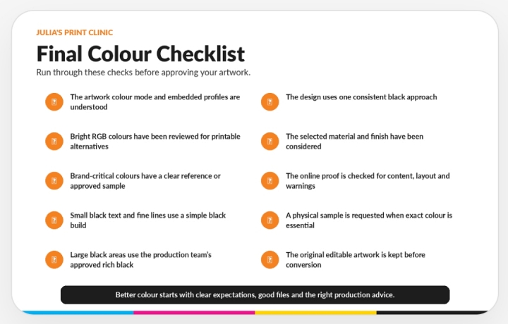
Understand whether the file contains RGB, CMYK or spot colours.
Review very bright RGB colours.
Keep the original editable artwork.
Avoid repeated colour-mode conversions.
Understand the intended profile and workflow.
Use an appropriate simple black for small text and detail.
Use the production team’s preferred rich black for large areas.
Keep black values consistent.
Consider the selected material and finish.
Discuss a physical sample where colour is critical.
Julia’s Pro Tip - Treat the Screen as a Guide
“If a colour is important enough for your customer to reject, it is important enough to discuss before the full print run.”
Frequently Asked Questions
Should all print artwork be converted to CMYK?
Not automatically. The correct workflow depends on the file, output profile and production process. Graphic Warehouse preflight identifies RGB, CMYK and spot colours, so ask the team when you are unsure rather than applying a random conversion.
Why does my blue look duller in print?
Some bright RGB blues sit outside the printable range of a particular CMYK output condition and are mapped to a less luminous printable blue.
What black should I use for small text?
A black using only the black channel is generally safer for small text and fine lines. Ask the production team if the selected product has a special requirement.
What rich-black formula should I use?
There is no single formula that suits every large-format printer, ink set, material and profile. Ask Graphic Warehouse for the preferred rich-black build for the selected product.
Can a Pantone colour be matched exactly?
A Pantone reference is useful, but digital CMYK reproduction may simulate rather than use a separate premixed spot ink. Discuss a physical sample or colour-critical workflow where exact appearance matters.
Is the online PDF proof colour accurate?
An online proof is useful for content, layout, size, position and preflight warnings, but a screen cannot guarantee the exact physical printed colour.
Why does the same artwork look different on vinyl and fabric?
Materials have different whiteness, texture, gloss, opacity and light behaviour. These characteristics affect the colour that the viewer sees.
Need a Hand?
Need Help Checking Your Colours?
Unsure whether your file contains RGB, CMYK, spot colours or mixed black builds?
Send your artwork to Julia’s team before placing the order or use Graphic Warehouse’s artwork setup service from £15.
We can help identify likely colour issues, explain preflight warnings and advise when a printed sample should be considered.
Matic Media
Tel: +44 (0) 330 380 0172


.jpg)