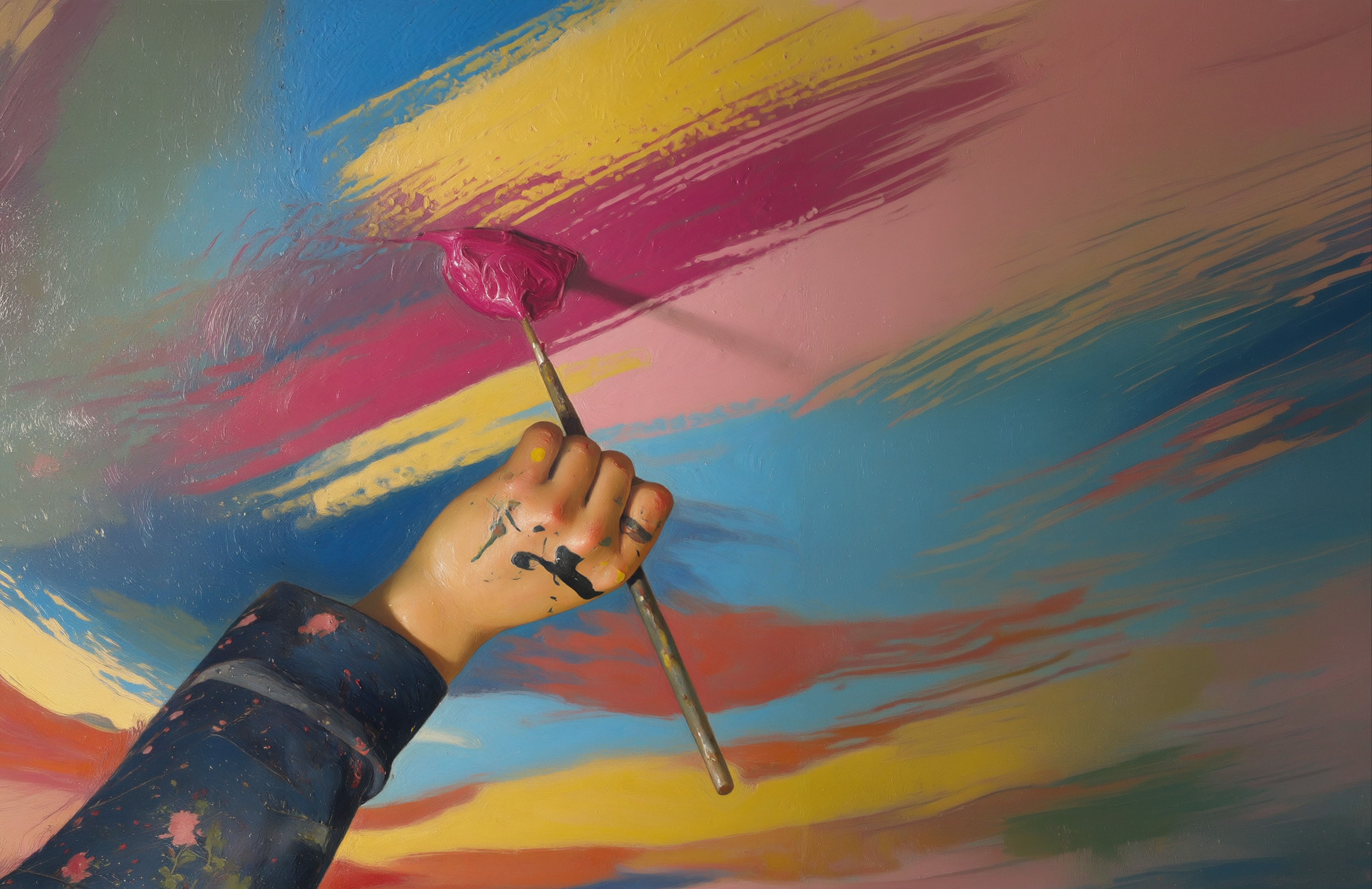
Michelangelo Buonarroti was a pretty good painter, although he considered himself primarily a sculptor. If you’ve ever painted a ceiling you’ll know it’s a pain in the neck - literally. So imagine doing it 60 feet up on a rickety wooden scaffold in the huge dome of a sixteenth century chapel, depicting biblical scenes in intricate detail, and spending more than four years over it.
Imagine then your client, in this case the Pope, coming in after you’ve finished, looking up and declaring ‘you’ve missed a bit’. You’d be more than mortified and would probably throw yourself off that said scaffold.
But MB had a trick up his sleeve, actually learnt from another Renaissance master, Leonardo da Vinci. He used a flat mirror to take a second glance at his work, and from another angle. This is a similar idea to traditional proof readers scanning sentences backwards to check for errors, and is a quick fix solution if you don’t have the luxury of being able to walk away and come back later.
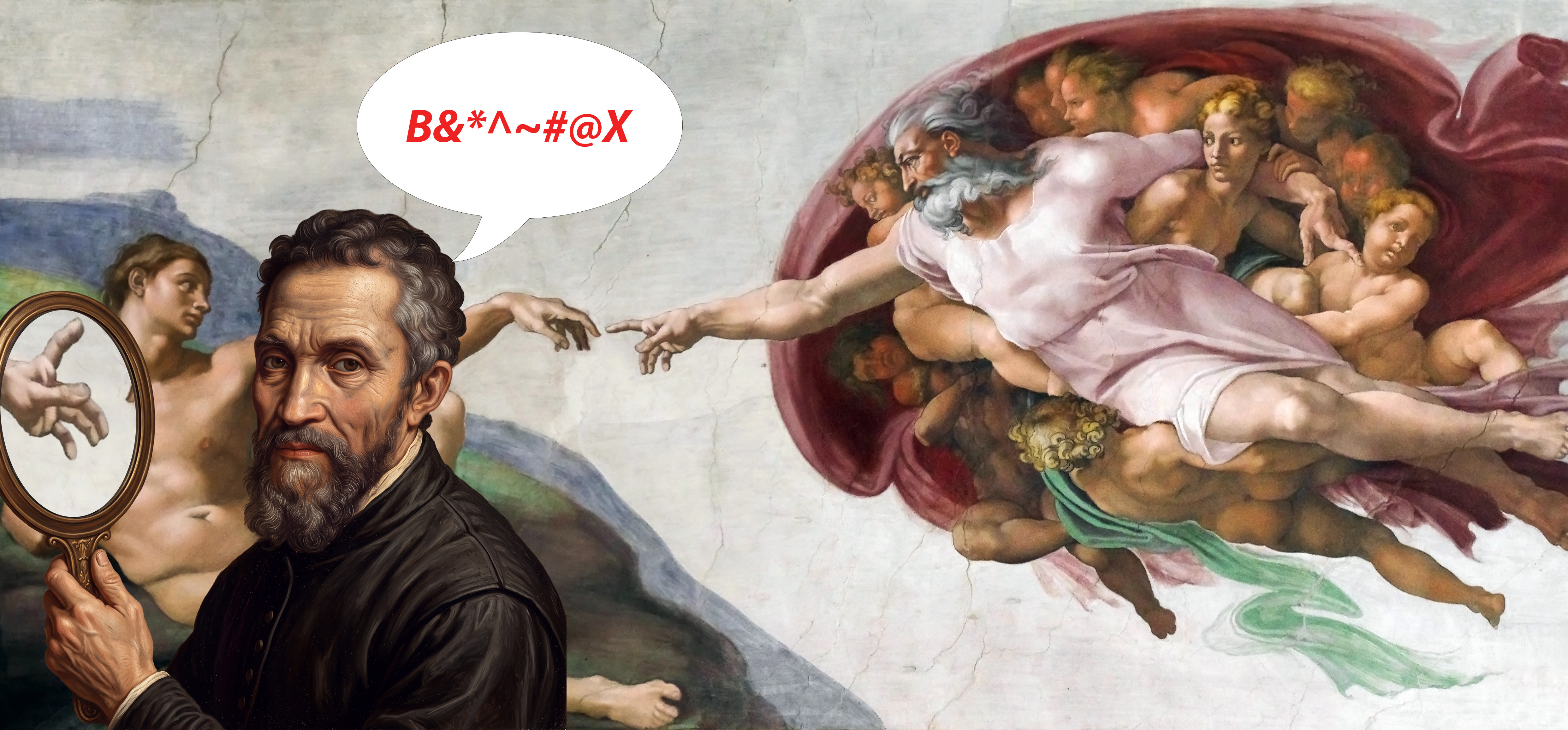
It is well known that staring at the same thing for too long can make you blind to things that are perfectly obvious to a fresh pair of eyes, a syndrome that is particularly common now we spend so much time glued to a screen, and under pressure to work at a pace dictated by demand. We don’t need a flat mirror, however, as we already have one, and one that is much more flexible. Almost every editing software has an ability to flip or rotate an image, or even isolate a layer to avoid distractions in the background.
It may not be the perfect answer, but it's worth at least trying a tip from several centuries back improved with modern technology particularly as it may highlight features that have been distorted by the software - eyes and hands for example which seem to be the most common victims of artificial enhancement.
MB had another daily task in that he had to mix his own paint - he couldn’t pop down the road for another tin of emulsion. Each day a fresh batch of pigments had to be ground down from the limited minerals available in Rome at the time, but he was very creative and able to achieve colours much more vibrant than the more muted ones associated with artworks of the time. So much so that when the Sistine Chapel frescoes were cleaned in the 1980s, removing decades of yellow residue from candles, many were shocked thinking the original had been ruined.
What stood out was the high degree of colour contrast in the work - something we would now describe in digital terms as high dynamic range. Because he was bonding the water based pigments with drying bright white plaster, the effect was to extend the colour range, increasing the luminosity difference between one colour and another -giving the images punch in effect. This is of course exactly what pixel based colour content does to digital images and why I introduced this little historical interlude as a reference.
If someone liked the Sistine Chapel and wanted an exact copyprint for his bedroom wall, it just wasn’t possible on paper, on canvas or anything other than a freshly plastered wall. Not then, not now, for all the technology at our finger tips. Our modern day problem is that the devices which most people use to create and review images are way ahead of our ability to print in terms of the colour range available, designed as they are to show movies, games and lots of impactful pictures which look powerful on screen but are likely to fall flat on paper.
Preparing files for print is part of our job description and historically customers were content to rely on expertise and advice in performing this task. However the digital revolution that has placed creativity within everyone’s reach has dramatically changed that relationship. Now you have to justify that process and often patiently explain it. There is as yet no magic app that will do the trick and users do not expect to incur extra costs for something they don’t understand.
The problem is the conflict between what is visible and the binary information which lies below it translated by a processor to a mechanical printer. It’s a problem because almost all of the adjustment is done manually - by eye- on a monitor. It was always an issue because early CRT screens were notoriously fickle and prone to stray from original registration. Modern LCDs are much more stable and with the standardisation of RGB as a colour space results are much more consistent.
However sRGB, adopted as the universal web measure, approaches its third decade, the capture technology has moved on considerably with the advance in sensors and their ability to register colour. Display P3 is rapidly becoming the norm for mobile devices and has a wider colour range, particularly in reds and greens, as well as maintaining a strong vibrance and brightness on screen. That’s why images on iPhones really pop out at you. Michelangelo would have loved it.
Adobe RGB still remains the industry standby for both photography and print and has both a wider colour gamut still and a greater consistency across the platforms. However, some camera sensors can register a wider range still called ProPhoto RGB but as this contains information which can probably not be displayed and therefore adjusted it’s surplus to most requirements.
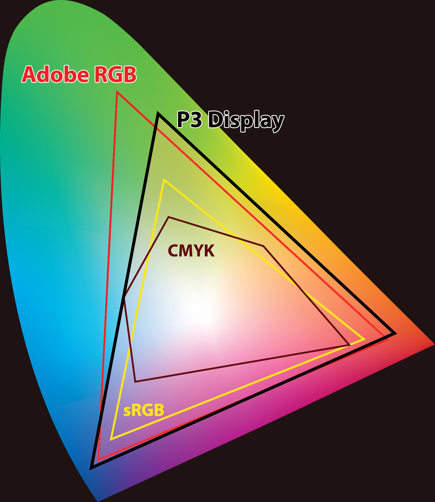 This is not even touching on the dilemma of converting RGB to CMYK. Most print shop digital printers do a pretty good job of managing that with the correctly adjusted software. And it is print on demand after all so you can explain some variance. If it is required for litho printing however it is important to convert to CMYK rather than just ‘save as’ once again using the visual reference to make any colour adjustment in troublesome hues.
That’s why the monitor display is so important - not just in calibration but in establishing that it is actually capable of reflecting the most accurate colour range. You don’t have to go to the expense of some ultra high spec design studio types, but decent 4K devices are now common and when you consider that a resolution of 3840x2160 is about the average for an original phone camera it puts it into perspective. If you are still working from an old monitor, it's time to consign it to the museum. Ensure your display has a strong Adobe RGB content for most effective registration then at least you can be sure you have a competitive advantage over the average customer in the what-we-see-vs-what-you-see debate.
An additional consideration is ambient light. Most print shops are inevitably very bright and inviting workspaces by their nature, so it's important to be sure that what you are viewing is not unduly affected by spill from the surroundings. Most people working on mobiles will have their brightness and contrast wound up to the max viewing in outdoor places and that will affect what they think they are looking at. In the days when students started using laptops we used to have an issue with image files created in the varied environments of coffee shops and wine bars. Things may have moved on from there but the issues still linger.
I’ve taken some space to talk about the importance of visible colour because unless you have certainty in that, it is a waste of time looking at the finer details of image manipulation, or the correction of colour to output for print. We know instinctively that some colours we can see are just going to be problematic in the limited range available when pressed onto paper. There is an inevitable compromise, and it's very much a human decision. So far artificial intelligence has very little positive to contribute to the printing process.
In fact, quite the opposite, in the popular torrent of machine generated design clones it seems determined to churn out not only a repetitive menu of the same formulae which many people prefer to call slop, but deliberately pick combinations of hues and graduations that will be difficult to reproduce other than on backlit screens. Fortunately this instant artwork is short lived and not expected to be faithfully repeated outside of the internet but it is a consideration to go along with the often low resolution content. The one does with the other as without quality digital information there is very little that can be done to correct it.
This may seem obvious to the experienced print worker but I’ve chosen to go over the basics because I’m very much aware that a whole new generation has grown up without that prior experience, and for whom the technology is just accepted rather than questioned. We are at one of the sharp ends of that conundrum because we have to balance hi-tech with what is essentially a very low tech process. It may have moved on from Michelangelo’s time but it is still all about mixing pigments.
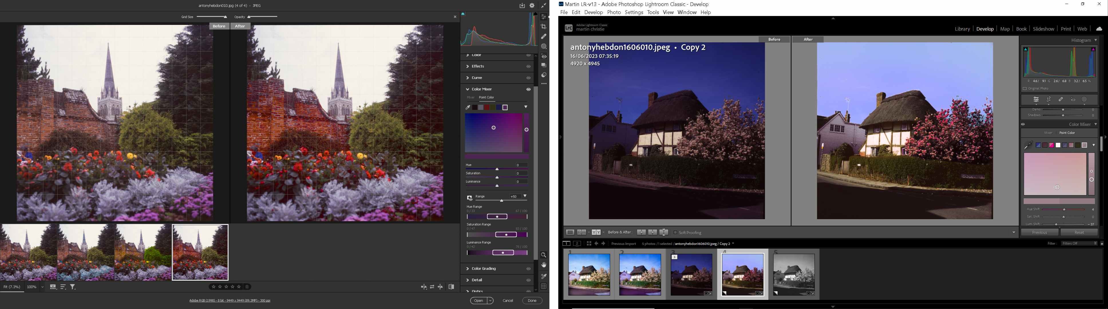
More image editing developments will come in next month's issue as October sees the annual Adobe MAX junket in Los Angeles. You can follow it by registering free on line where you will at least be able to sift through all of the enthusiastic revelations of game changing applications. I will try and rescue any details that may be of use to us directly, but indirectly it is likely there will be further moves to make the whole world creative, and thus provide us with even more of the same.
One recent update to Photoshop however is long overdue and for once is really useful in preparing for print. This is a new Light Adjustment Layer feature which has been placed in the main PS workspace. Most photographers will be familiar with the Camera RAW filter or Lightroom and these controls are generally the very first things to turn to after opening a file. Unlike original RAW cameras files, however, almost everything we receive has already been preprocessed by the customer intentionally or more often unintentionally by the owner’s device. This dramatically reduces the possibilities so it is very much a repair and recovery operation but nevertheless it helps, and most importantly, it is manually operated.
Adobe has always kept the traditional controls like brightness, contrast and exposure for example on the top shelf, but up there they are awkward to use and often conflicting in operation. If you want to stay in the dark ages you can still find them. But putting them all together in one user friendly panel gives them also much greater flexibility in use, and provides a much more sensitive touch over the whole tonal range.
Prints are always going to come out darker than they appear on screen and often a colour difference is confused with the actual density of the image - the actual amount of colour rather than the hue. Also very few photo images have consistent exposure across the range so being able to quickly tweak shadows and highlights is an asset. Resist the temptation of radical movements - often very slight actions make quite a difference and one quick tip is rather than use the sliders, use the pointer and up and down arrow keys to make tiny increments.
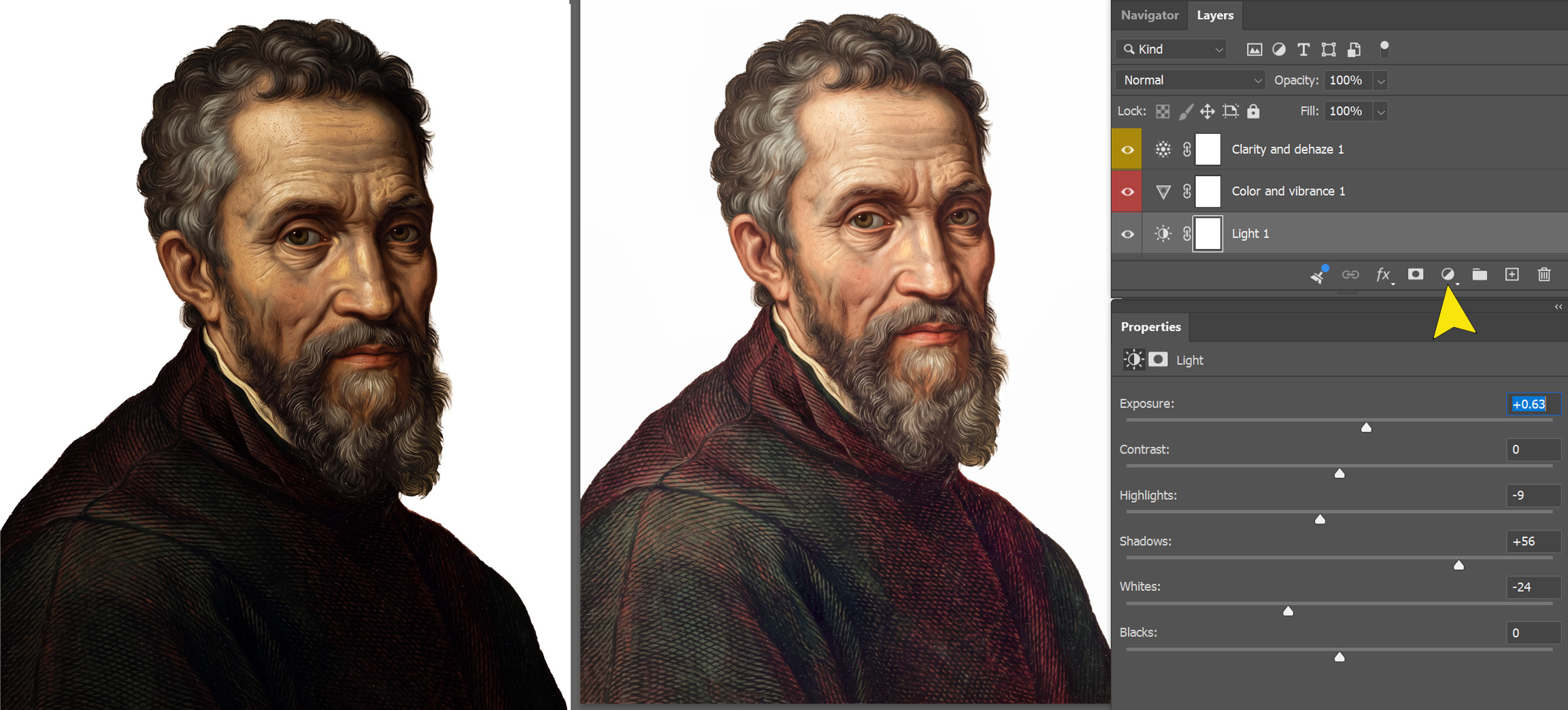
Once you’ve mastered the Light layer you can move on to Color and Vibrance, and when you are really confident. Clarity and Dehaze for further fine tuning. Plus of course as you are using layers you can alter the opacity of each to control the overall effect. This is by far the simplest method for print preparation as it is not destructive and has complete user control and recovery options.
A more comprehensive guide is in the link below as well as your invite to Adobe MAX - enjoy!
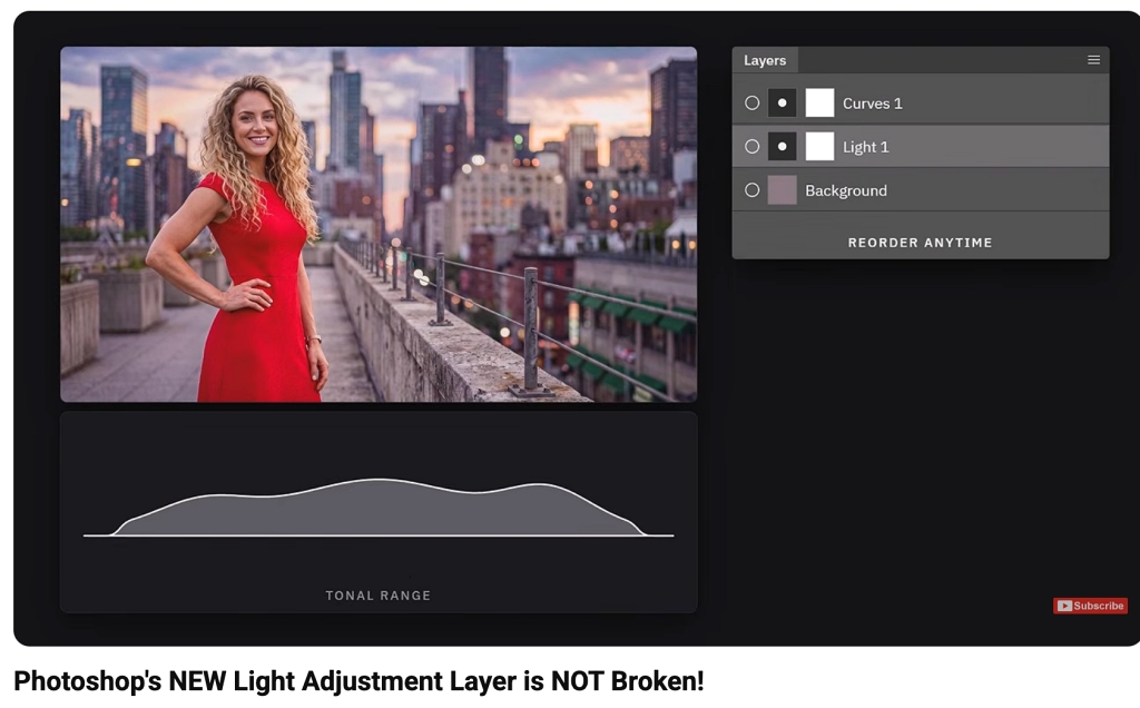
PS new Light Layer explained and more..
https://youtu.be/M-ux9hgZd9A?si=47ndg9KSxJKIoCXO
Adobe MAX

.jpg)